JazzCash Design System
Welcome to the JazzCash Design System, a collaborative effort between Systems Limited and IBM. During the redesign of the JazzCash mobile application, we encountered problems with design consistency, foundational weaknesses, and design challenges arising from the brand's established look and feel. As a result, we crafted this system by incorporating best practices and carefully considering regional and market-specific design requirements and perspectives. Our goal was to achieve scalability and consistency in our design, and efficiently streamline the organization's potentially chaotic process. We aimed to give a fresh new look while maintaining alignment with the current branding.
- My Role
- Research, Visual Design
- Tools
- Figma
Typography
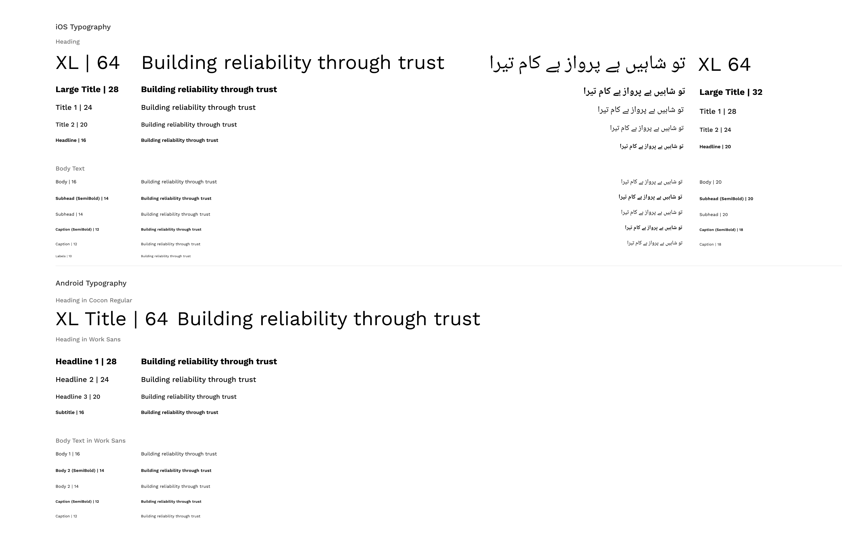
In our design system, we carefully selected Work Sans as the primary font for the mobile interface. Its clean and versatile design, with well-balanced character spacing and geometric letter structure, made it an ideal choice. With a wide range of weight variations, Work Sans effectively serves as both a heading font and for body text, providing a consistent and harmonious visual experience. Additionally, for Urdu language support, we seamlessly integrated Noto Naskh Arabic into the system. This font not only complements Work Sans but also ensures a seamless and cohesive interface design for our users.

Iconography
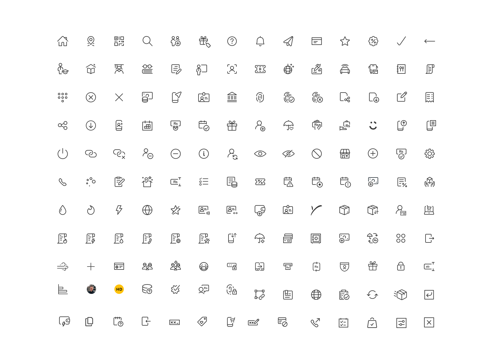
In JazzCash design system, we prioritized simplicity and informativeness. To achieve this, we integrated the material design icon library, aligning seamlessly with the overall visual language of the system.

Spacing

Color Palette
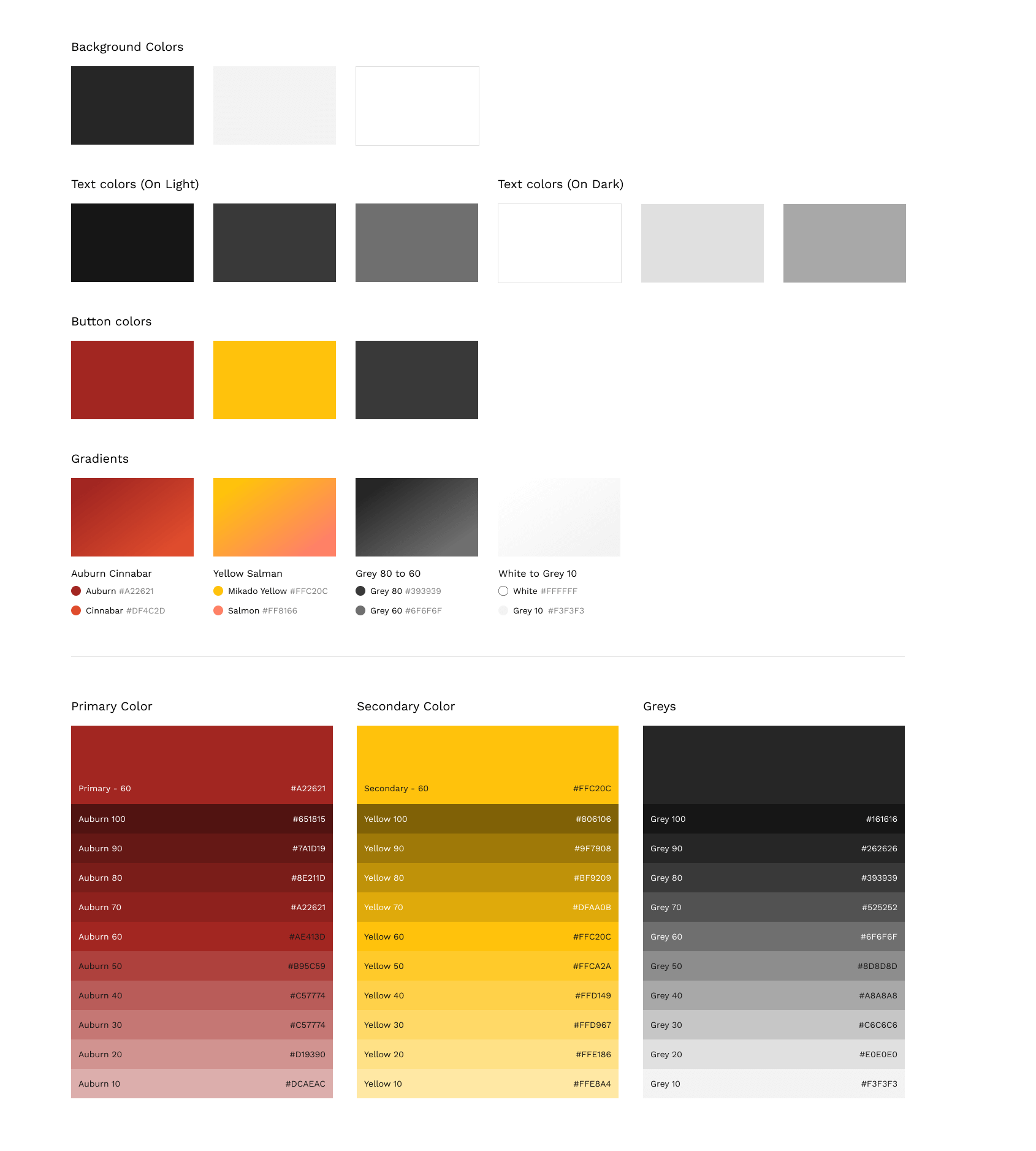
In the JazzCash design system, we place clear communication at the forefront of our color usage while appreciating the significance of aesthetics.

Buttons
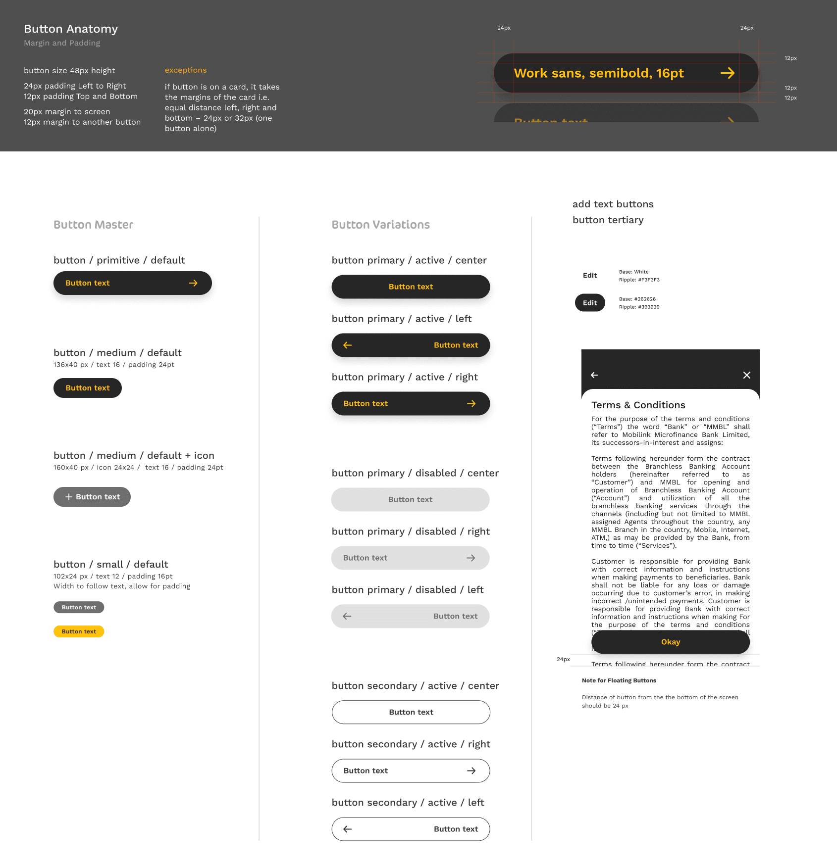
In the JazzCash design system, we recognize that buttons play a fundamental role in user interactions, and each button can have multiple states. These states, active, hover, focus, disabled, and loading, are carefully incorporated to ensure seamless user experiences. Our system offers four distinct button types: Primary, Secondary, Subtle, and Text, each accompanied by an icon version.

Form Fields
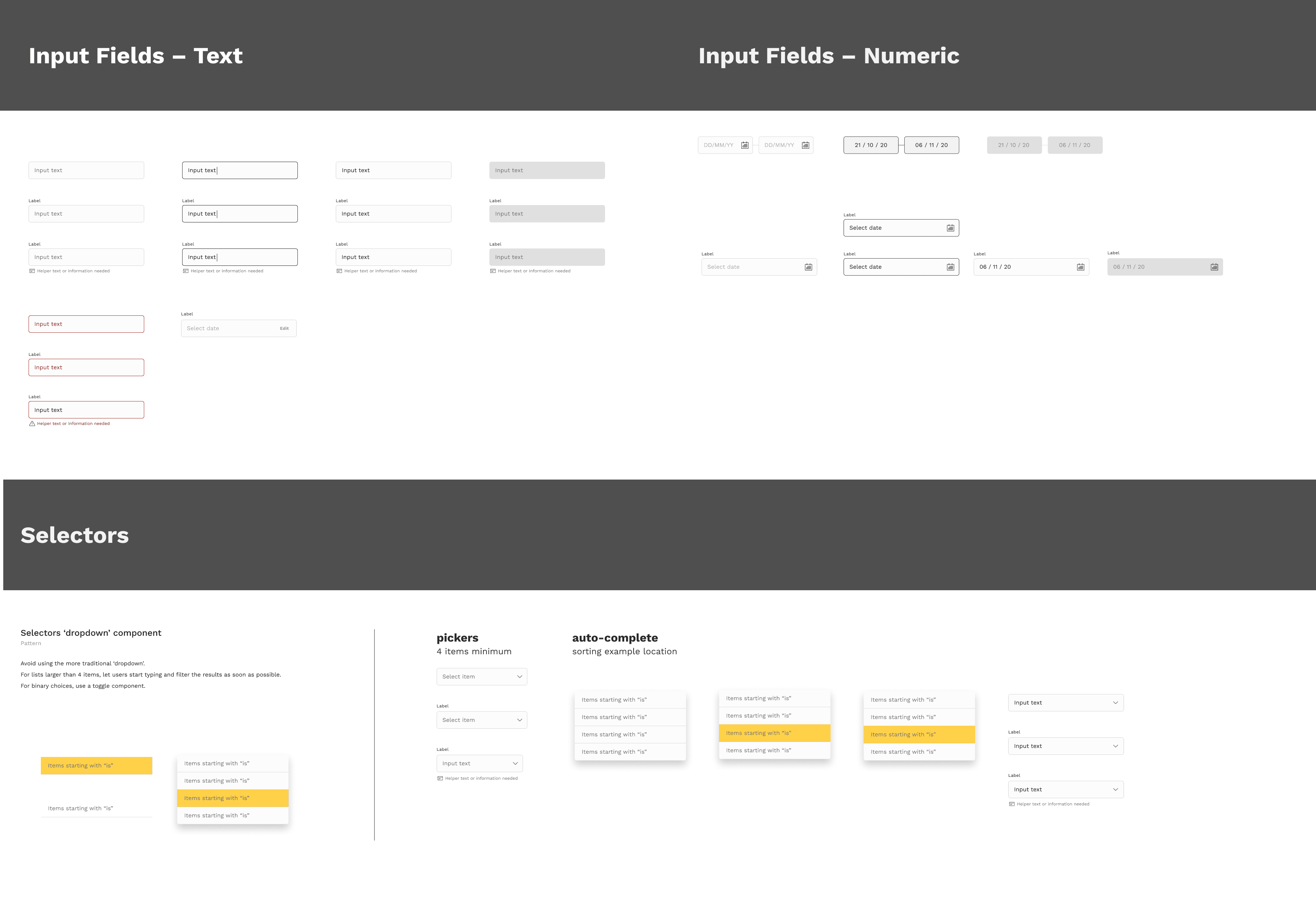
Considering accessibility top priority in our design approach, we ensured form field intuitive and inclusive.

Other Components

Thanks for checking out my work!
If you are interested in learning more about the project or would like to collaborate, please feel free to contact me.