JazzCash - Mobile Wallet App Redesign
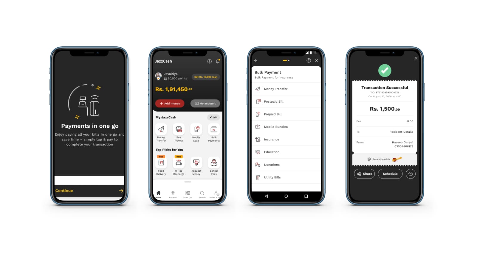
In 2020, we embarked on a redesign project to enhance the user experience of Jazzcash, a popular mobile wallet used by over 10 million people each month. Our goal was to streamline financial transactions and provide a seamless journey for our users. This involved revamping features such as fund transfers, bulk payments, merchant view, and confirmation receipts. We also prioritized maintaining brand consistency and worked within the constraints of the existing mobile app. Additionally, we developed a design system to ensure consistency throughout the application.
- My Role
- UX Researcher, Mobile App Designer, Design System Builder
- Tools
- Figma, Mural, Slack, Clickup
- Timeline
- 8 Months

Introduction
JazzCash is Pakistan's leading digital payments platform, with around 39+ million monthly active users. It was first launched in Pakistan in 2012, and we had the opportunity to revamp it along with the design team of IBM in 2020. The goal was to enhance the user experience and interface, improving usability and increasing adoption rates. Throughout the 8-month project, our team of UX designers, developers, and stakeholders worked together to deliver a seamless mobile payment solution.
To ensure a user-centered approach, we prioritized extensive UX research and engaged directly with JazzCash app users to gain valuable insights into their needs, motivations, and frustrations. Armed with these insights, we embarked on a comprehensive design process, incorporating UX best practices and utilizing the research findings to shape the app's redesign. Additionally, we developed a design system to establish a cohesive visual language and consistent interface elements throughout the app, further enhancing the user experience.
This case study showcases the comprehensive approach taken to revamp JazzCash, highlighting the importance of user research, iterative design, and collaboration in delivering a successful mobile wallet app redesign.
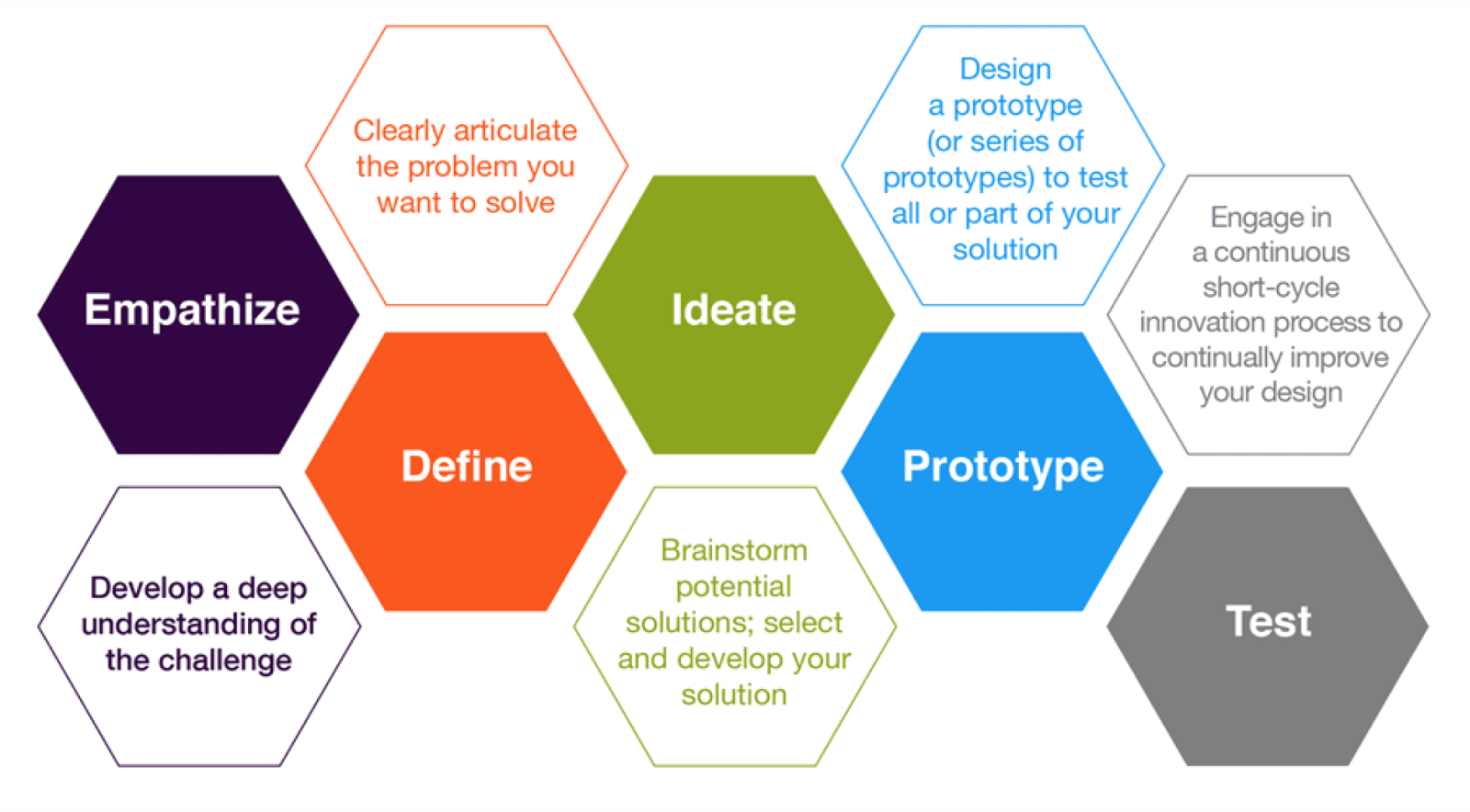
The Design Process

01 - Empathise
Surveys
To initiate the redesign process, we conducted extensive user research to gain valuable insights into the requirements, aspirations, and challenges faced by JazzCash users. Our research began with conducting user interviews and engaging with a diverse group of JazzCash users to understand their current usage of the app. We also conducted online surveys with a larger audience to gather valuable feedback.
The research revealed that users found the current JazzCash interface too complex, causing serious usability issues that significantly hinder user engagement. Furthermore, it was discovered that a significant portion of the user base had low digital literacy levels, requiring special attention in the redesign.


Competitive Analysis
To understand the market landscape and identify best practices, we performed a competitive analysis. This involved evaluating direct competitors and analyzing their features, design patterns, and user flows. We also compared our features to those of our competitors, highlighting the areas where we excel and identifying opportunities for improvement. Through this analysis, we identified successful design elements and features that could be incorporated into the JazzCash redesign.
By evaluating competitors' strengths and weaknesses, the team was able to identify opportunities to enhance the JazzCash app's user experience and differentiate it from competitors. This analysis played a crucial role in shaping the redesign strategy and decision-making process.
02 - Define
User Personas
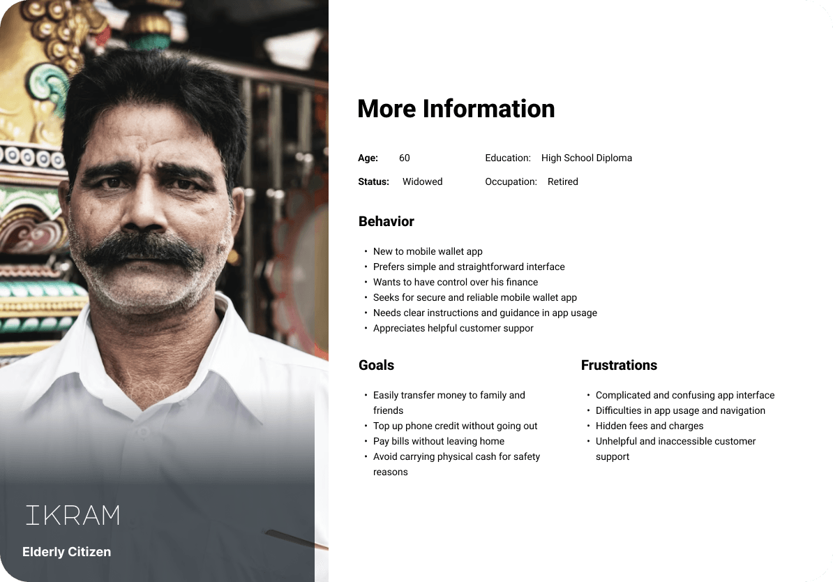
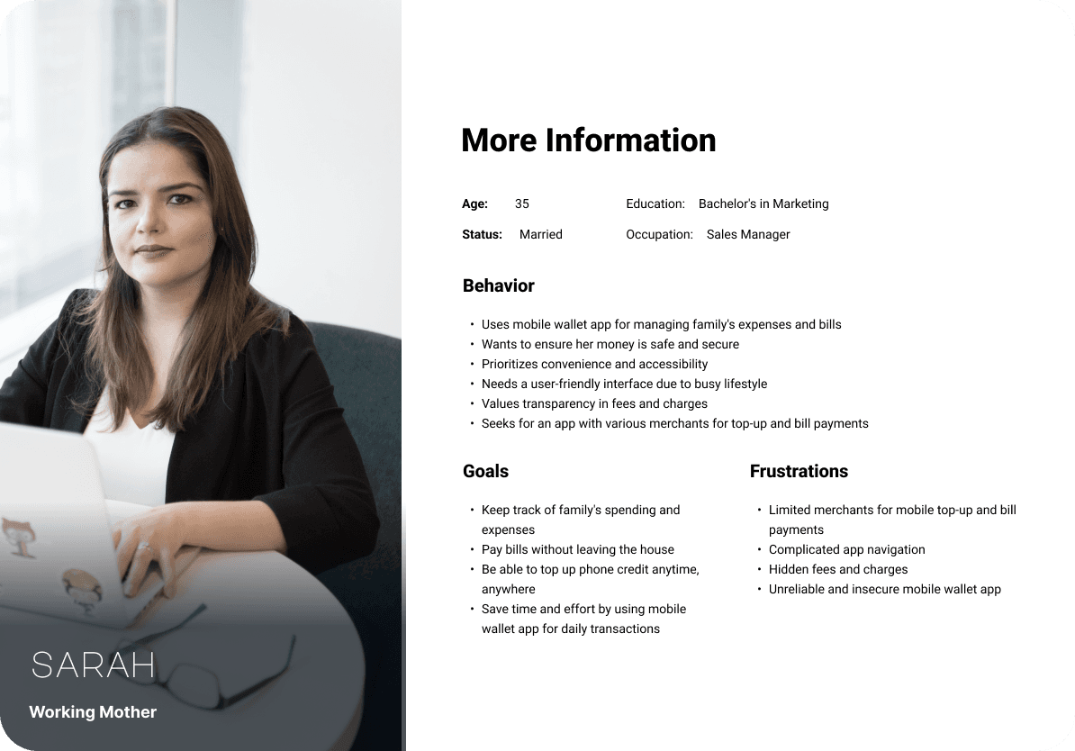
Based on the research findings, user personas were created to represent the diverse user base of JazzCash. These personas captured the characteristics, goals, and pain points of different user segments.
Problem Statement
Based on the research findings, we defined the problem statement:
The existing JazzCash app faced challenges related to usability and user adoption. The complex interface and lack of user-friendly features hindered the overall user experience. Additionally, catering to a diverse user base with varying digital literacy levels posed a significant challenge for the redesign process.
03 - Ideate
Features Jamming
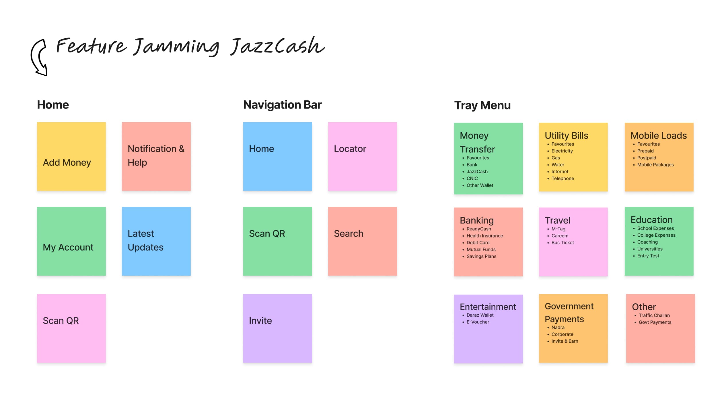
During our ideation process, we conducted a collaborative feature jamming session to brainstorm and identify potential features that could address user needs and improve the overall user experience. By considering feedback, current app features, and competitor analysis, we prioritized and selected the most valuable features to incorporate into the redesign. Our primary objective was to cater to the needs and preferences of our target audience. This session aimed to generate a list of features that can elevate the user experience of the JazzCash app and deliver more value to the users.
During our ideation process, we conducted a collaborative feature jamming session to enhance the overall user experience and cater to our target audience. Our brainstorming session involved taking into account feedback, current app features, and competitor analysis to identify potential features. We then prioritized and selected the most valuable features to incorporate into the redesign. Our ultimate objective was to generate a list of features that provide more value to our users and enhance their experience with the JazzCash app.
This involved brainstorming and identifying potential features that could address user needs and improve the overall user experience. By considering feedback, current app features, and competitor analysis, we prioritized and selected the most valuable features to incorporate into the redesign.
To select the features for discussion, we considered several factors. These included evaluating the app's current features, gathering user feedback on their preferences and requirements, and conducting a competitive analysis of other mobile wallet apps in the market. By considering these factors, we aim to identify and prioritize the most valuable features that can enhance the user experience of JazzCash and better meet the needs of our target audience.

Sitemap
Our next step was to create a sitemap for the JazzCash app, which allowed us to visually map out the user journey and see which features would be accessible to them, as well as how they would interact with the app. This process helped us to identify any potential problems in the flow of the app and ensure that the user experience was smooth, intuitive and catered to the needs of our target audience.
To visualize the user journey and ensure a smooth and intuitive experience, we created a sitemap for the JazzCash app. The sitemap allowed us to map out the flow of features and interactions, identifying potential problems and areas for improvement. This step helped ensure that the redesign catered to the needs of the target audience and provided a seamless user experience.


04 - Design
Wireframes
To brainstorm and test the initial designs, we created low-fidelity wireframes. We improved the wireframes over multiple iterations and adjusted the user flows. This process was very valuable and helped me to identify changes and focus on how to solve the user’s problem without worrying about the visual design. We tested the paper prototype with a few people, and most of them couldn’t navigate through the first screens of the prototype without some background story. I realized it would be simpler to add onboarding screens in the wireframe for first-time users.
We started the design process by creating low-fidelity wireframes. These wireframes helped us iterate on the user flows and solve user problems without being concerned about visual design elements. We conducted user testing with paper prototypes to gather feedback and make necessary adjustments to the wireframes. Additionally, we realized the importance of onboarding screens for first-time users and incorporated them into the wireframes.


UI Design
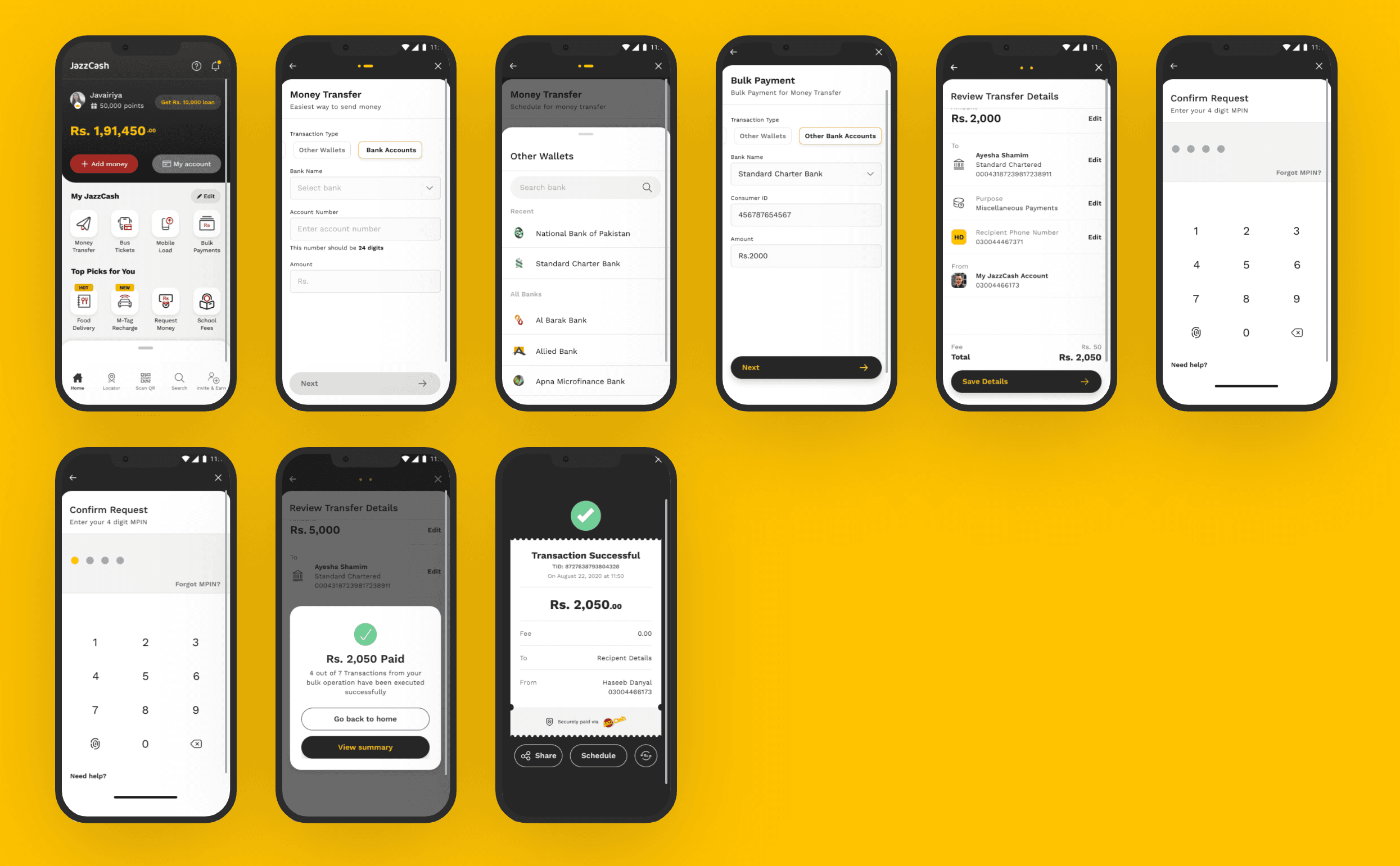
We faced some design challenges while working on JazzCash's product as the brand already had an established look and feel. However, our aim was to provide a fresh look while also maintaining consistency with the existing branding.
To achieve this, we developed a comprehensive design system that included typography, color palette, iconography, and UI components. This system ensured consistency and provided guidelines for future design iterations. Creating a design style guide and UI specifications document enabled effective collaboration among the design team, stakeholders, and developers.
We prioritized collaboration throughout the process and held regular feedback sessions and design reviews to improve the designs based on user testing and stakeholder input.

Learning
Revamping JazzCash was a very positive and constructive experience for me, as I learned a lot during this project. Starting from user research to high-fidelity prototypes, it taught me so much about the user-centric design process. Having a concrete understanding of how users think and feel is essential to make the right design decisions along the way. Likewise, the user testing phase helped me gather real feedback on the visual design and navigation. I couldn't have designed a product that users enjoy using without the help of the people who actually used it. Creating the design system for the UI design of JazzCash taught me valuable lessons about design principles.
Thanks for checking out my work!
If you are interested in learning more about the project or would like to collaborate, please feel free to contact me.
