Salonit: Improving Salon Experiences
Salonit is a smartphone application that simplifies the salon appointment booking process. Our objective was to address the challenges of busy schedules and unorganized appointment bookings in the salon industry. By providing a platform where users can easily find and book appointments at various salons based on their preferences, Salonit offers a convenient solution for salon-goers. This case study provides a comprehensive overview of the design journey undertaken to achieve our goal with Salonit, showcasing the step-by-step process of UX research, UI design, and implementation. It highlights the successful outcomes achieved in creating a user-friendly smartphone application for salon appointment booking.
- My Role
- UX Researcher, UI Designer
- Tools
- Figma, Miro
- Timeline
- 2 Months (1 Month - UX Research, 1 Month - UI Design)
Introduction
From ideation to implementation - Crafting exceptional user experiences with a streamlined design process.
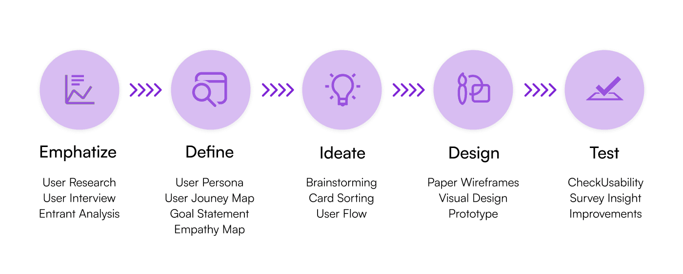
The Design Process

01 - Empathise
Competitive Analysis
To initiate the design process, we conducted a competitor analysis to evaluate the suitability of the product for the target audience. Our research focused on analyzing existing apps in the market, including Shedul, Olready, and SmartCoiffeur. These apps were selected as they had similar goals to our project. We thoroughly examined the apps, solicited user feedback, and identified key strengths and weaknesses.
Strengths: - Clean and modern UI design - Specific product details and ratings - Trending offers available - Quick service selection on the home screen
Weaknesses: - Lack of information and confusing color hierarchy - Limited salon availability in certain locations - Absence of stylist information and ratings - No display of nearest salon options - Lack of a dedicated feature to search for nearby salons - Absence of appointment reminders
This analysis helped us identify the strengths and weaknesses of existing solutions, guiding us in addressing the shortcomings and delivering an improved user experience with our product.
Online Surveys
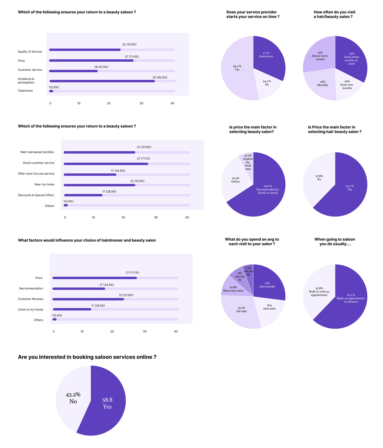
After conducting a thorough competitive analysis and developing user personas, we gained valuable insights into the features and functionalities required for our application. To further understand user needs and preferences, we conducted online surveys divided into three sections: Visitation, Frustrations, and Adaptations. The survey results revealed key findings:
Approximately 48% of women reported experiencing delays in their salon appointments.
A significant majority, around 35%, visit the salon more than once a month.
57% of women prefer booking appointments in advance.
58% of women are interested in finding salons located near their homes.
About 68% of women want to know the prices and details of services offered, 60% value reading reviews, 63% consider the salon's location, and 49% are interested in viewing images of the salon and stylist's work.
Based on these findings, approximately 57% of respondents expressed interest in using online booking services for salons. This data will inform our design decisions and guide the development of a user-friendly application that meets the needs of our target audience.
Surveys

02 - Define
User Personas
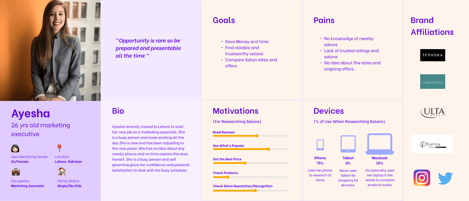
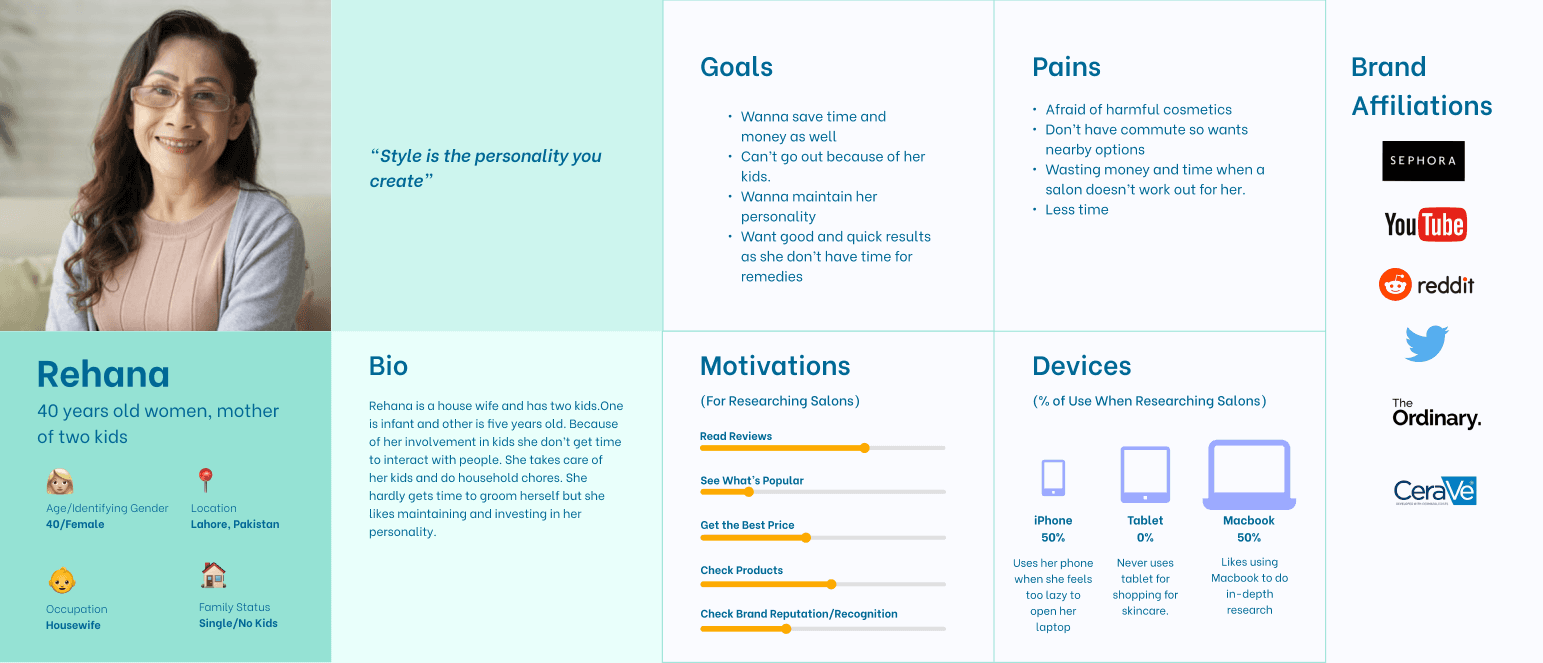
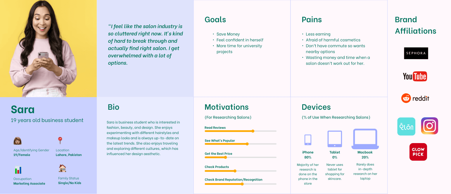
In order to better understand and address the needs of our users, we developed three personas. These personas helped us prioritize user types and provided valuable insights to guide our problem-solving process. By creating personas, we gained a clear direction and identified new design opportunities to meet their specific needs.
The personas we developed are as follows:
1. Working Women (25-35 age bracket): This persona represents career-oriented women who seek efficient salon services that fit their busy schedules.
2. Aged Women (40-50 age bracket): This persona represents mature women who prioritize quality salon services and have specific beauty requirements.
3. Young Students (18-25 age bracket): This persona represents young girls who are price-sensitive and seek the best deals for basic salon services. They visit salons on a monthly basis.
These personas helped us empathize with our users and provided valuable insights for designing a solution tailored to their unique preferences and requirements.
03 - Ideate
Contextual Inquiry
Field Visits to Salons
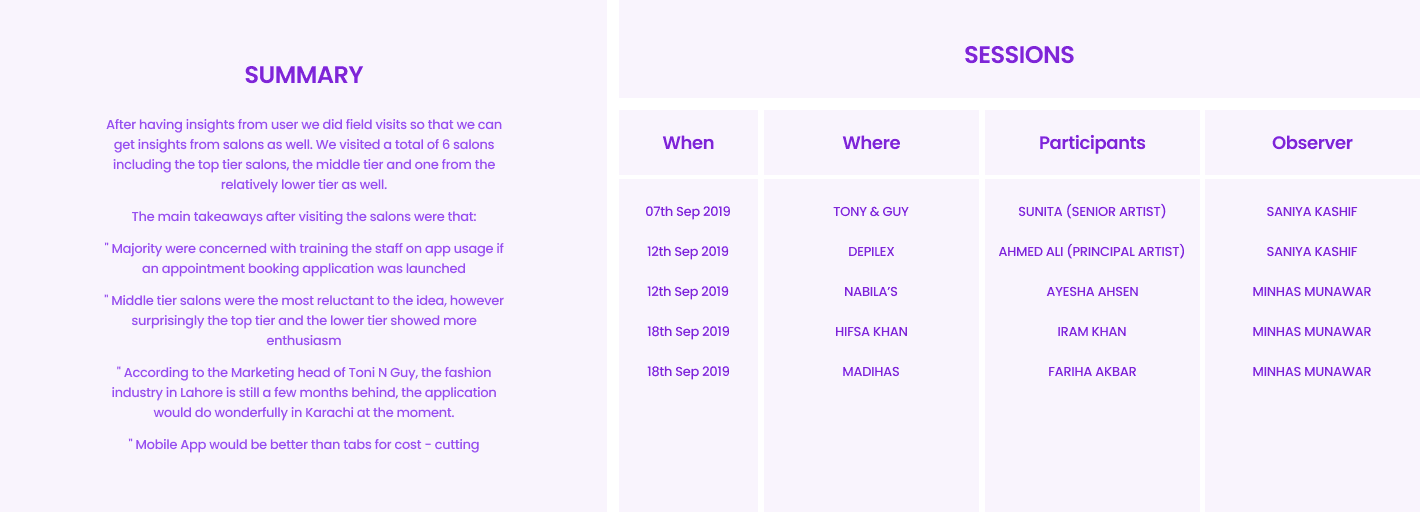
To gather insights from the salon perspective, we conducted field visits to six salons, including top-tier, middle-tier, and lower-tier establishments. During these visits, we engaged in discussions with salon staff and owners to understand their perspectives on introducing an appointment booking application.
Key takeaways from the salon visits were as follows:
- Majority of the salons expressed concerns about training their staff on the usage of the app if an appointment booking application was launched. - Surprisingly, the top-tier and lower-tier salons showed more enthusiasm towards the idea compared to the middle-tier salons. - The Marketing head of Toni & Guy mentioned that the fashion industry in Lahore is slightly behind, but the application would be well-received in Karachi. - Salons favored a mobile app over tablets, as it would be more cost-effective.
These insights from the field visits provided valuable input for our design process, allowing us to consider the perspectives and requirements of the salons alongside those of the customers.

Customer Journey Map
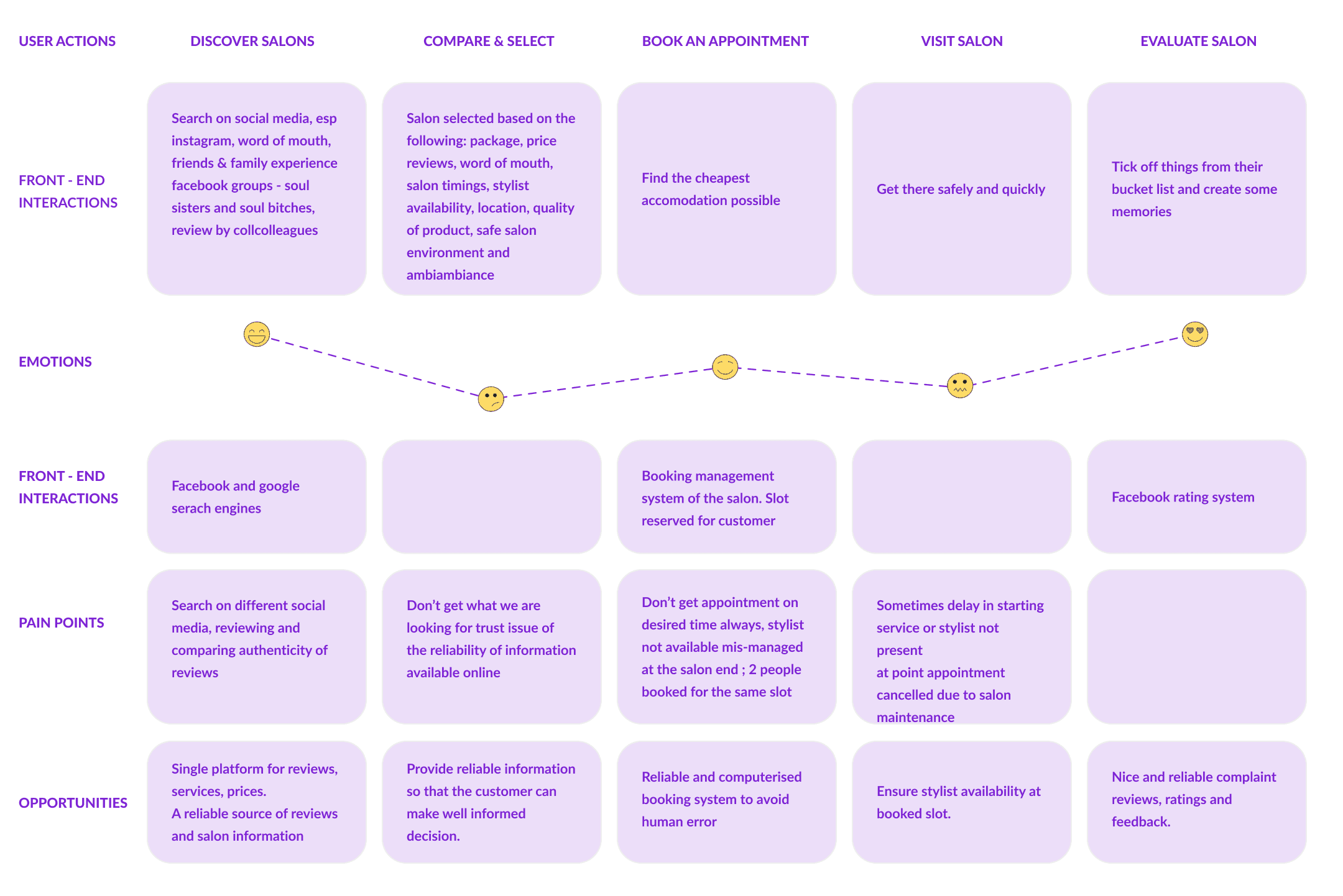
To gain a deeper understanding of how customers discover and engage with our service, we developed a customer journey map. This map allowed us to identify pain points and uncover opportunities for improvement throughout the customer journey. We focused particularly on the consideration and loyalty stages, where we found significant user problems and potential for enhancement. Using insights from the customer journey map, we streamlined the appointment booking process and introduced personalized recommendations based on users' past appointments. These improvements were aimed at providing a seamless and tailored experience to our customers, enhancing their satisfaction and loyalty.

Mind Map
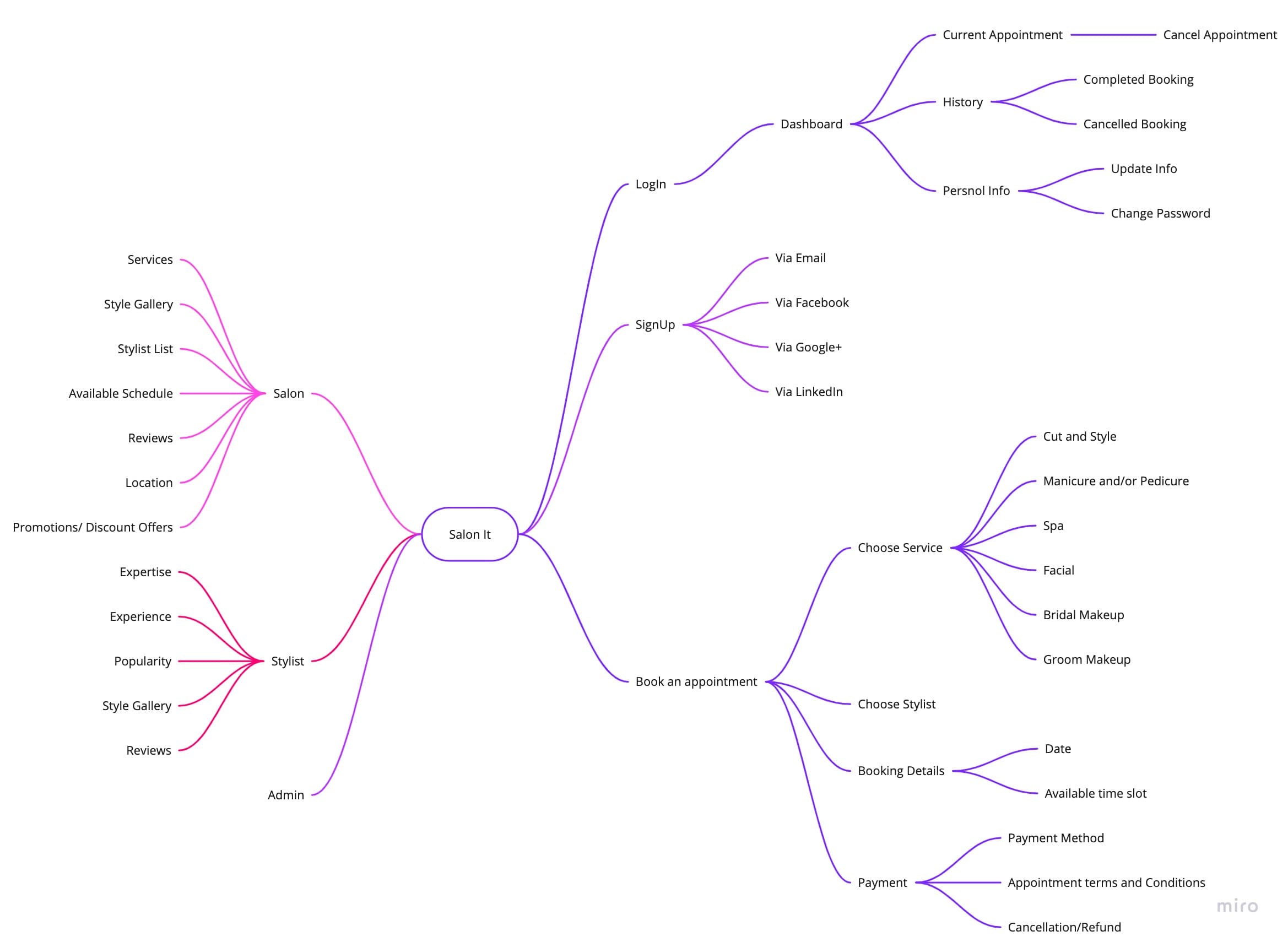
The mind map played a pivotal role in the design process of Salonit. It served as a visual representation of the app's structure, allowing us to define the overall flows and connections between different sections. By creating the mind map, we gained a holistic understanding of the app's navigation and user journey. This helped us in organizing and prioritizing the features and functionalities of Salonit, ensuring a logical and intuitive user experience. The mind map served as a valuable reference point throughout the design process, guiding us in creating a well-structured and user-friendly app.

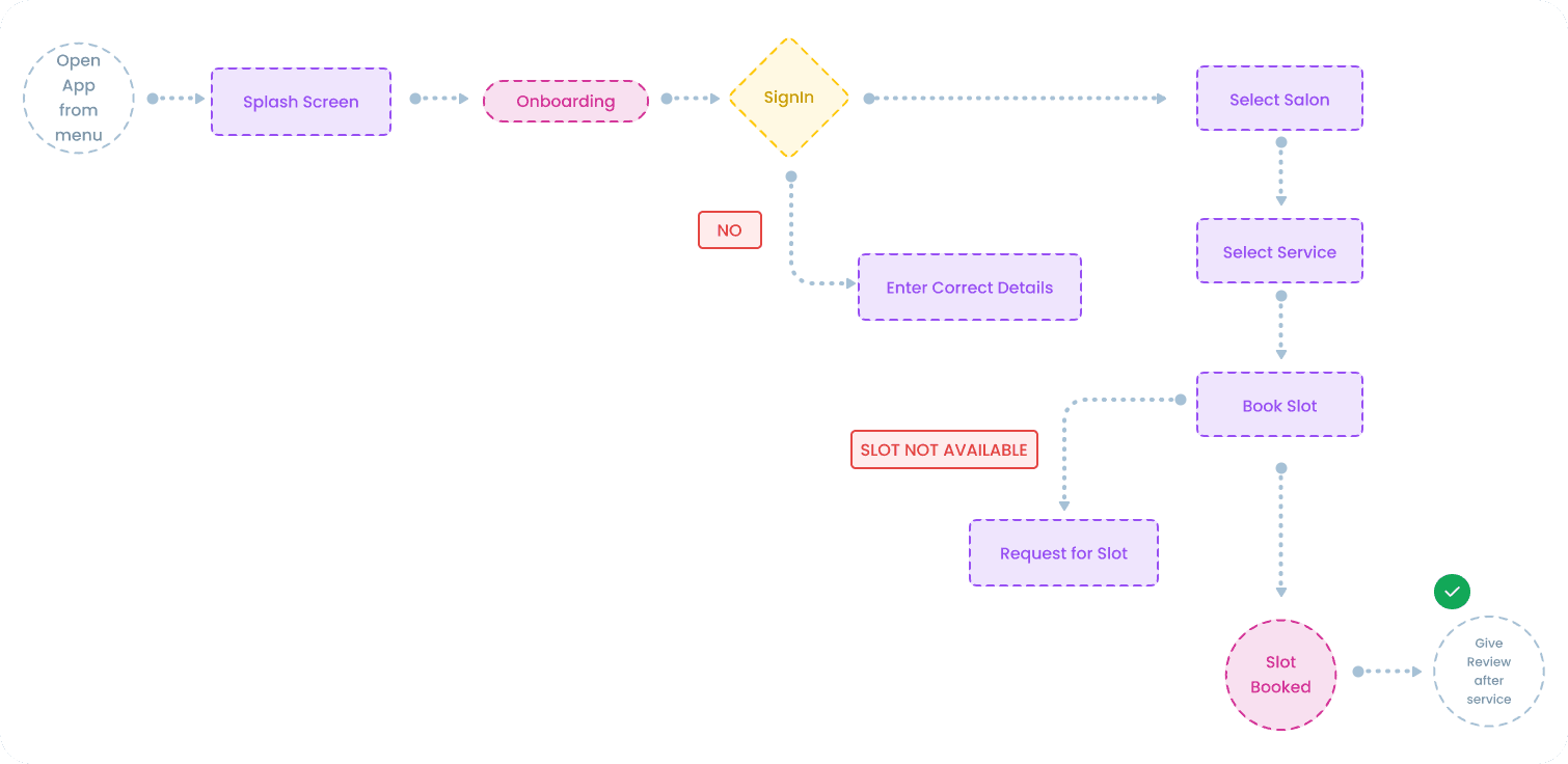
User Flow
Analyzing the user flow was a crucial step in the design process. It provided us with valuable insights into user behavior and allowed us to make informed design decisions that aligned with their needs and expectations. Through multiple iterations and refinements, we crafted a user flow that ensures a seamless and intuitive experience for users. The final user flow reflects a deep understanding of user journeys and aims to enhance the overall usability and satisfaction of the digital product.

04 - Design
Wireframes
In the wireframing stage, we used Figma to transform initial sketches into low-fidelity wireframes. These wireframes provided a defined structure for conducting user testing. After conducting four tests, we gathered valuable feedback that led to adjustments and refinements. With the insights gained, we progressed to creating high-fidelity prototypes for further evaluation and refinement.
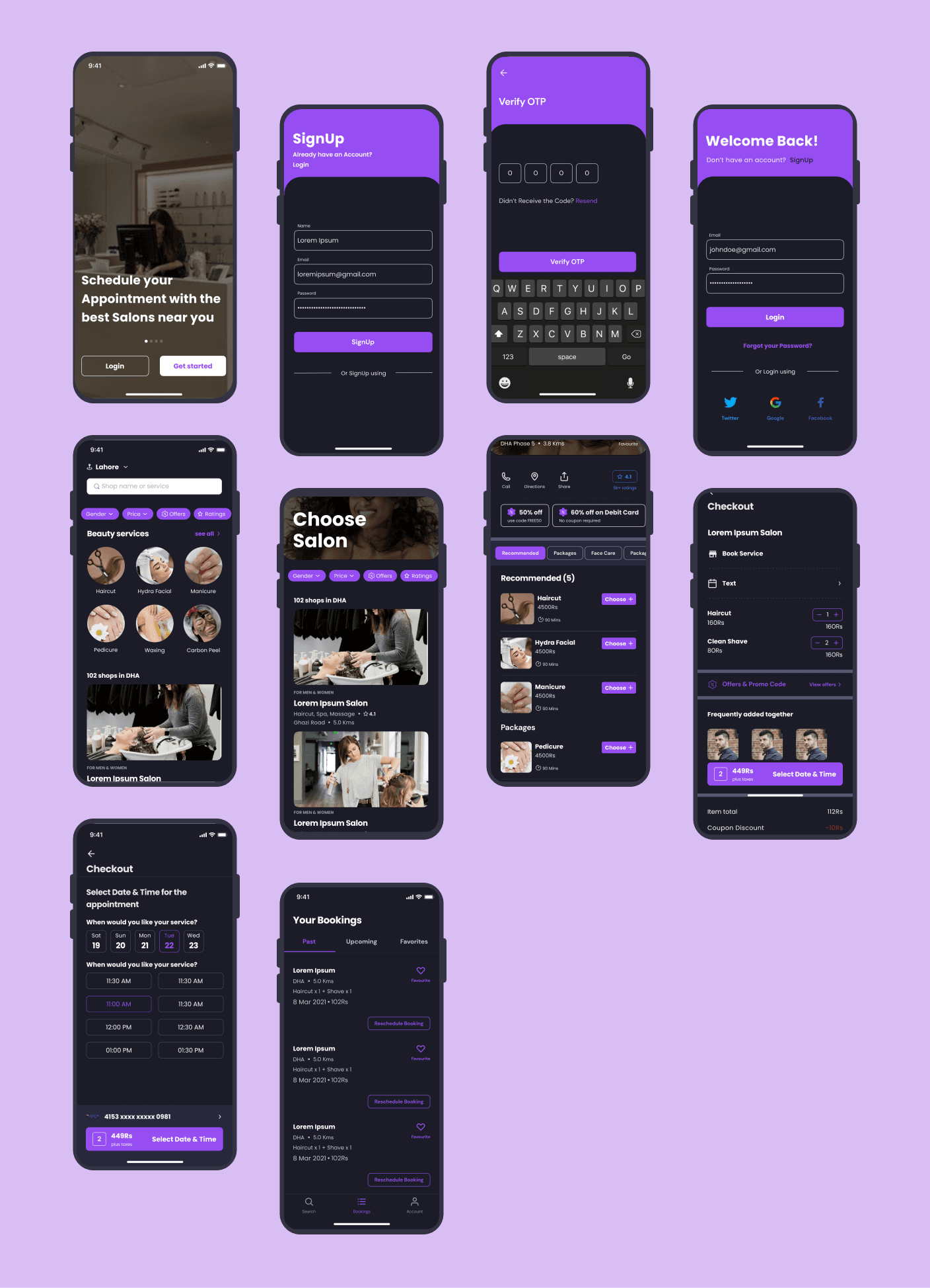
UI Design
After addressing the usability issues identified in the testing phase, we proceeded to design the final screens using Figma. Our objective was to develop a visually appealing and cohesive user interface that aligned with the brand's values and message. To ensure a competitive edge, we thoroughly analyzed the competition and drew inspiration from a comprehensive catalog of design references. By incorporating best practices and innovative design elements, we aimed to create an engaging and visually appealing user experience.

Thanks for checking out my work!
If you are interested in learning more about the project or would like to collaborate, please feel free to contact me.
